Four ways to render one field
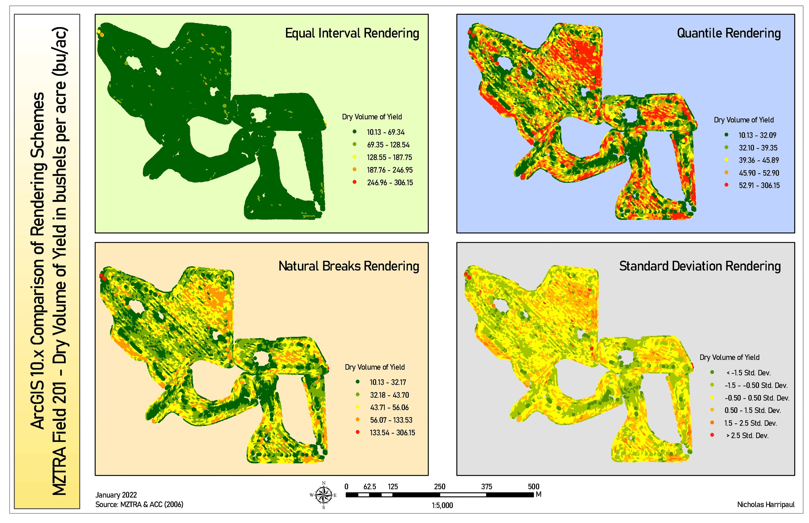
The same yield data classified four ways, where equal-interval collapses almost the entire field into a single class
Academic coursework / January 2022
Notes on method
This is the plate I would show first, because it is the only one that argues about method rather than reporting a result.
Every panel holds the same points, the same attribute, and the same colour ramp. Only the class breaks move. Equal interval divides the range into five equal slices, and because a handful of points reach 306 bu/ac while most of the field sits below 60, the first slice swallows almost the entire field. The map is not wrong. It is correctly rendering a scheme that the distribution defeats.
Quantile forces equal counts into each class, which maximises visual contrast and produces a field that looks violently variable. Natural breaks finds the gaps the data actually has. Standard deviation reframes the question entirely: it stops asking what the yield is and starts asking how far it sits from the mean, which turns out to be not very far across most of the field.
A reader handed any one of these alone would come away with a different impression of the same harvest. That is the argument. The classification is not a display setting applied after the analysis; it is part of the claim being made.