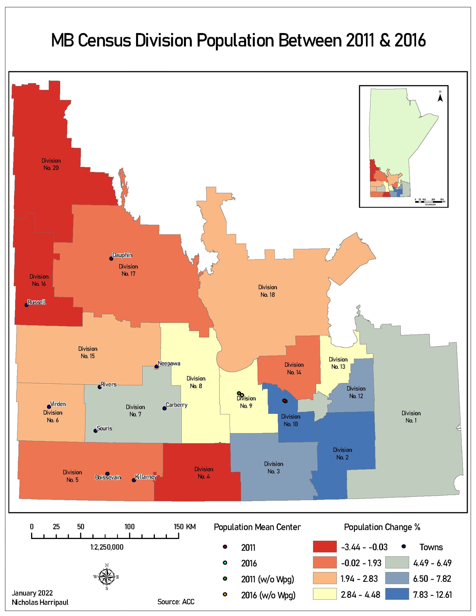
Manitoba population change, 2011 to 2016
Census division change, with the population mean centre computed twice: once with Winnipeg, once without
Academic coursework / January 2022
Notes on method
The choropleth is the straightforward half: divisions shaded by percentage change, decline in the north-west, growth in the belt around Winnipeg, a diverging scheme so that the sign of the change is legible before the magnitude.
The mean centre is the half worth explaining. A provincial population mean centre is a single point, and in Manitoba that point is largely an artefact of one city. Plot it for 2011 and 2016 and you learn very little, because Winnipeg dominates both. Plot it twice more with Winnipeg excluded and the four points together say something the choropleth cannot: how much of the province’s apparent centre of gravity is the city, and which direction the rest of the province is drifting independently of it.
Showing all four, rather than picking the flattering pair, is the part I would defend.